🏅🎖 Branding and Wayfinding System for Art Research Center
March 15th, 2015
- Client | Seoul National University
- Cowork | Minkyoung Lee (senior researcher), Prof. Kymn Kyungsun (director), Sohee Kim (researcher), Hye-eun Lim (researcher), Doyeon Yang (researcher)
- Duration | 3 months
- Responsibility | project management, font development, logo production, sign system design and production, supervise graphic design, user scenario and examination
- Tools | Indesign, Illustrator, Photoshop, SketchUp
- Awards | 2017 SEGD Global Design Award and IT Award 2015

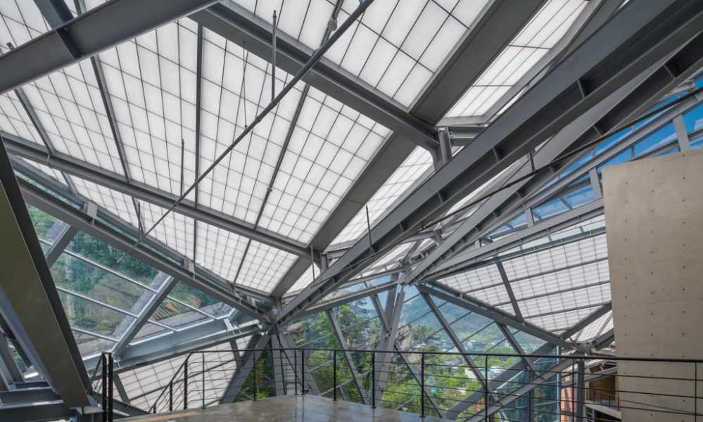
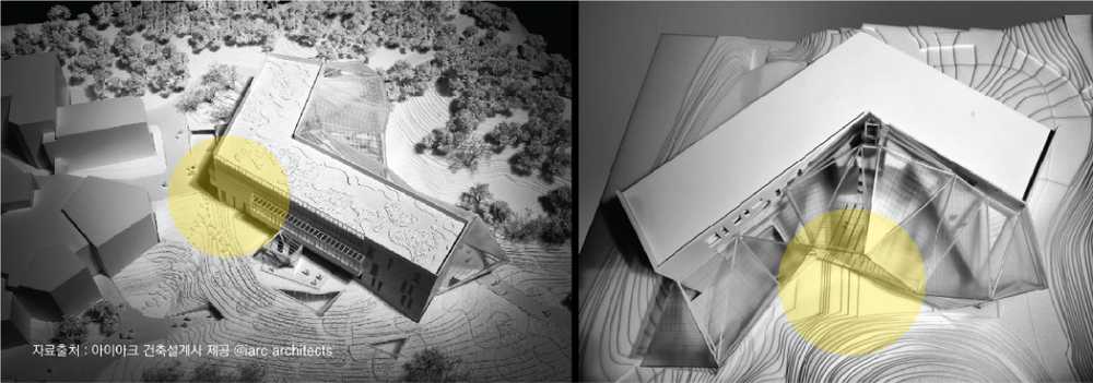
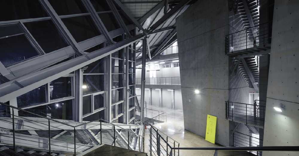
The Seoul National University Arts Research Center is a shared-use facility for the College of Fine Arts and the College of Music. Due to the unique structural form, which resembles a convergence of masses, the flow of movement through the space intersects across various levels and in varying directions. Our goal was to develop a unique wayfinding strategy and its identity system that makes navigating this complex space comfortable. We also expect that the graphic design and exclusive font applied to the sign system will provide users with an unique experience in this space.
CHALLENGE
The distinct structure built on the slope of a hill without a designated ‘ground-floor’ level as there are entrances and exits on each floor where the building meets the hillside. Students, faculty and visitors enter the building in relation to which part of the campus they are approaching the building from, so there is no clearly defined area to welcome and direct them to their destination, which leads to confusion.
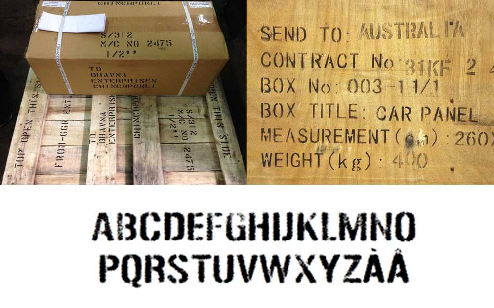
We developed a special font to express its characteristics getting an idea from the building's rough finishing materials. To maintain the building's atmosphere and for a quick implement of our work, we decided to develop a font that is similar to a stencil font. We invented it with two different styles of edges, round and sharp ones, to represent the meaning of art complex having two-sided properties of research and art.
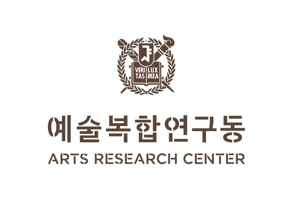
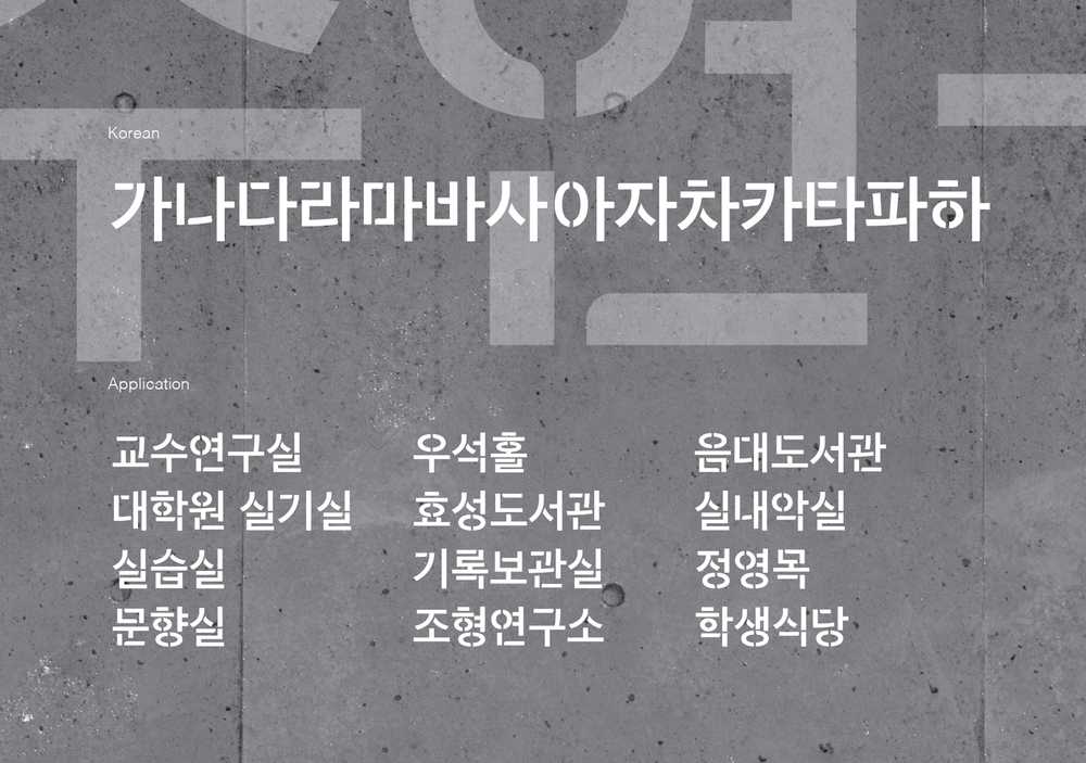
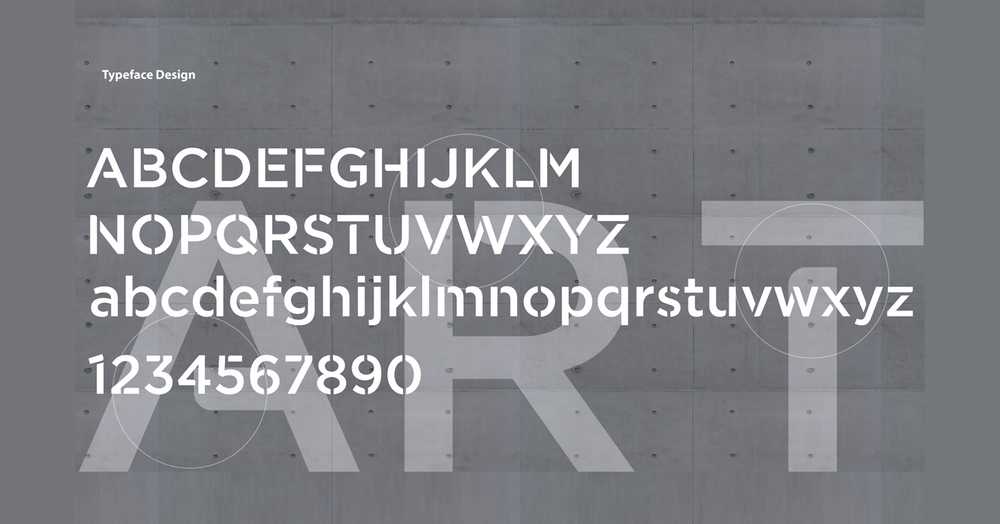
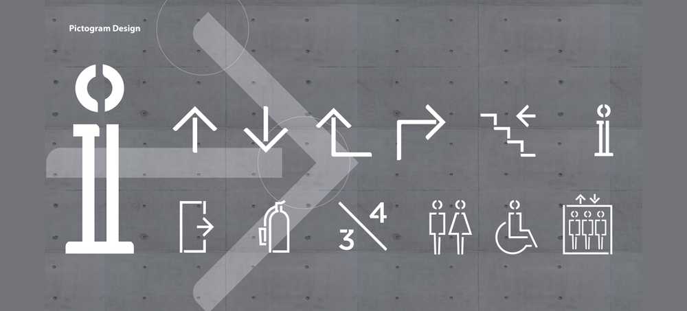
It was planned to be developed only in Korean and limited numbers of symbols, but we also produced English version in consideration of the integrity of the sign system design and thinking that it may be needed in the future.
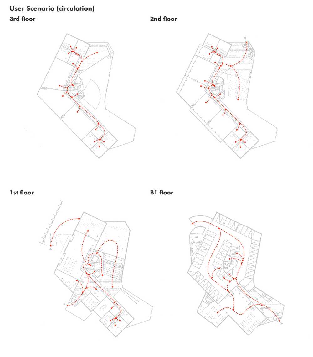
To implement the installation of signages, we made a user scenario. We counted the first floor as the main entrance because it has the largest door of the building and is accessible to other facilities. Therefore, we drew user flows into consideration of the accessibility of users as well as the frequency of use of internal facilities such as classrooms, workrooms, and public spaces.
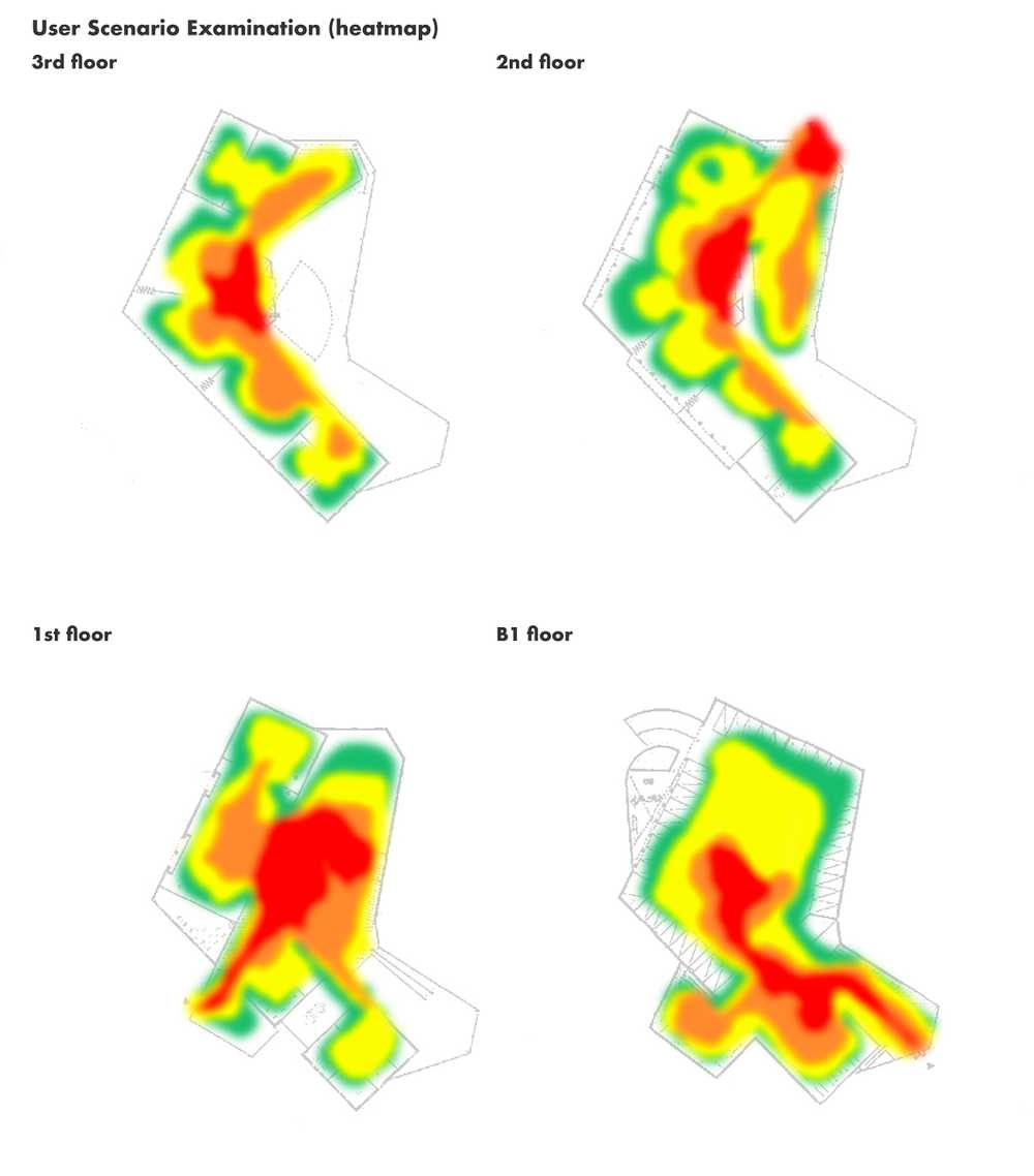
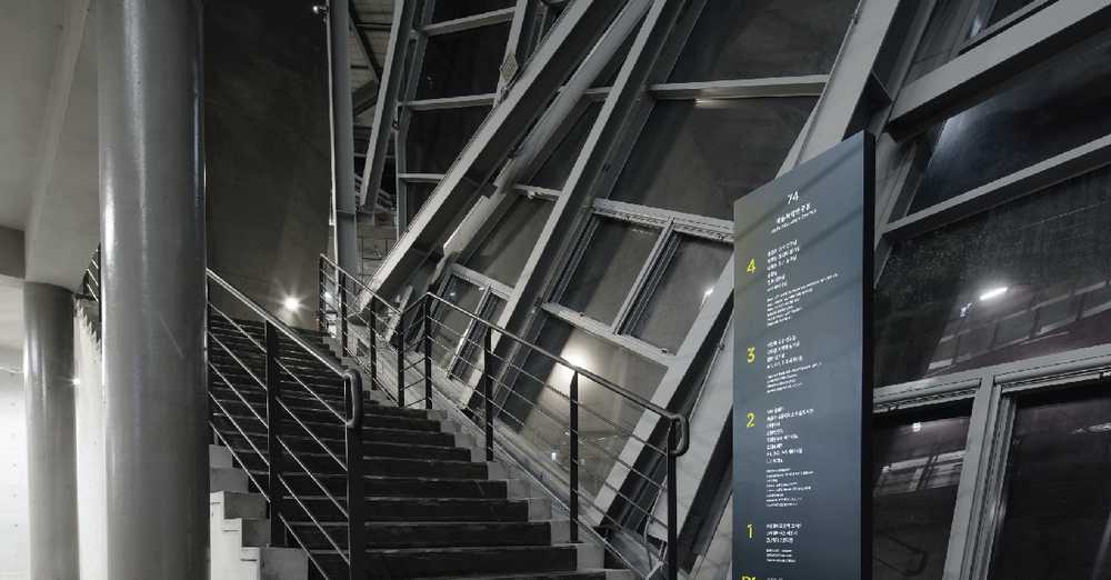
To examine the developed user-scenarios, we conduct analyses of the facility with its accessible points, foot traffic heat-maps, and the facility’s location in relation to the campus. Surprisingly known by the heat-maps, it was found that most students did not enter on the ‘first’ floor of the structure, and would rarely enter and exit the structure through the same door or even the same floor. Therefore, we made additional signboards in addition to the one we were going to install. One of them is a floor guide. This was able to effectively create an effect of image itself, not like normal installation.
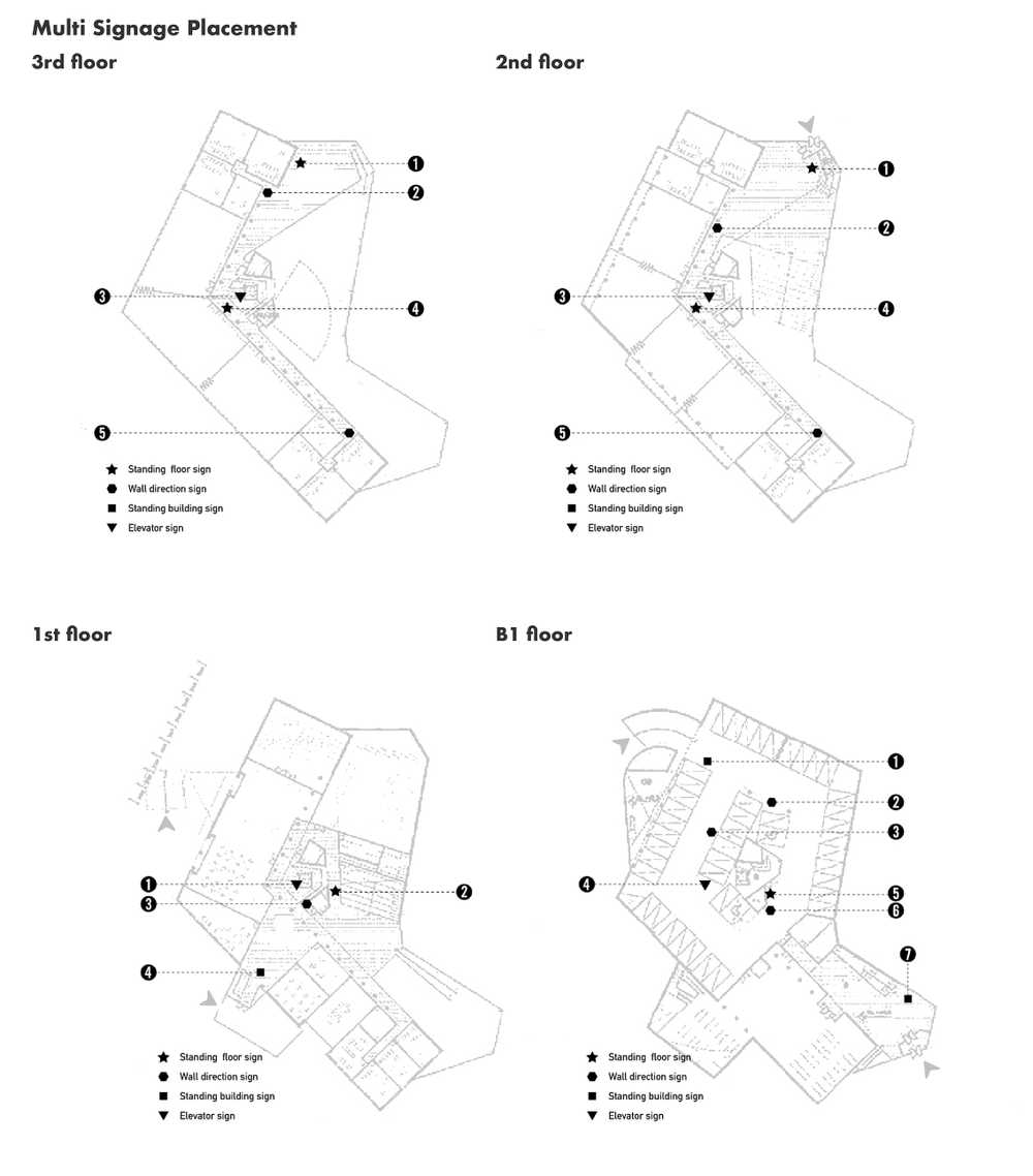
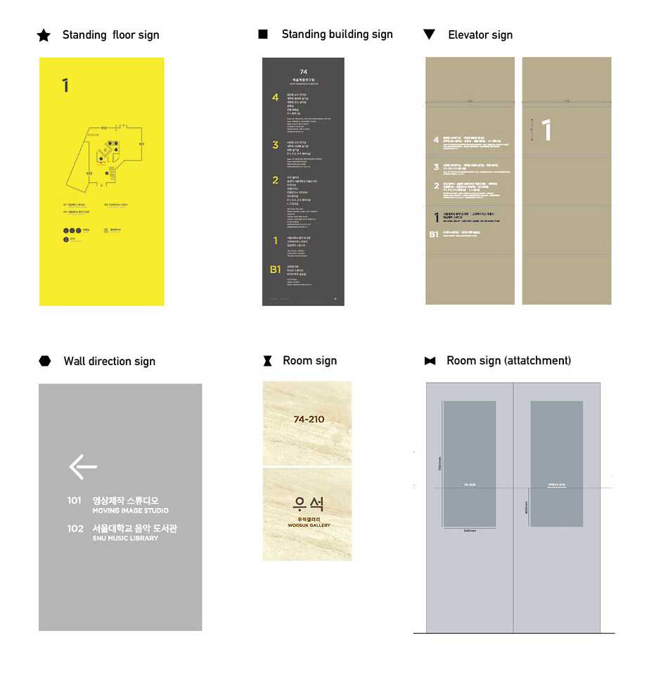
We have established the installation location of the sign through written user scenarios and validation. The same installation was fine-tuned because the entrances, structures, and use patterns differed from floor to floor.
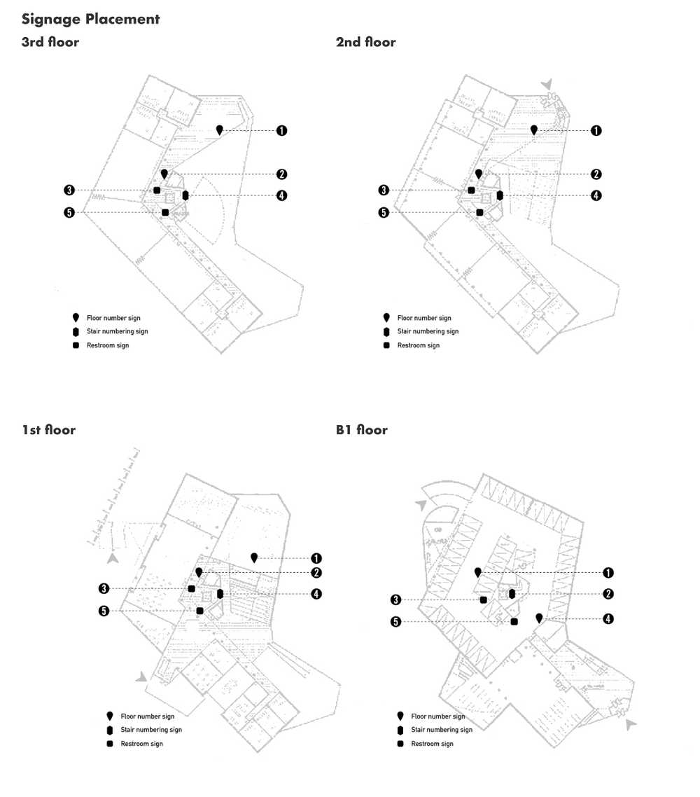
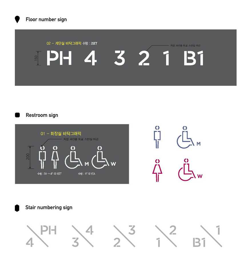
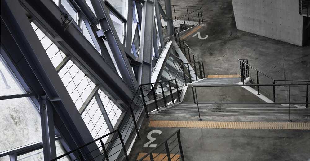
We solved the problem of people being confused about which floor they were standing on. We placed wayfinding graphics on the floor at the top of each staircase.
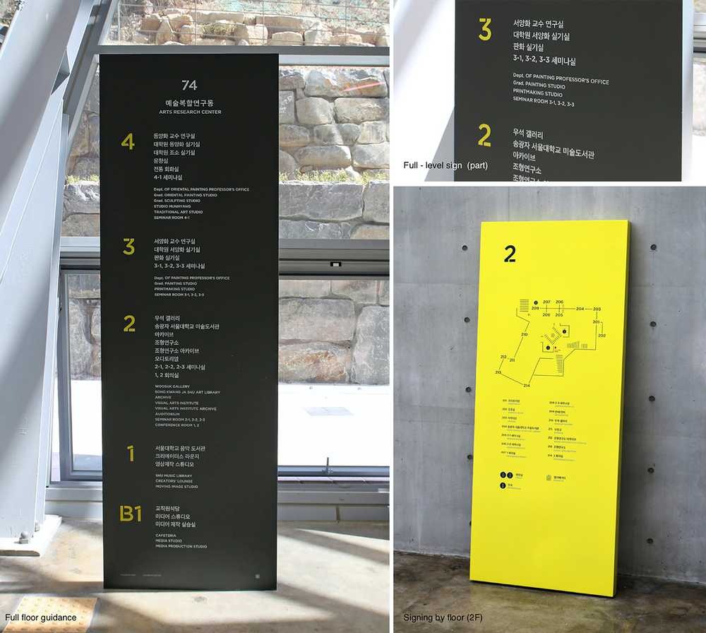
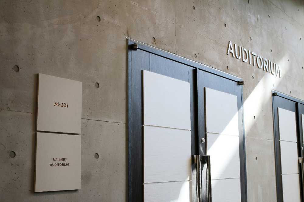
All graphics were designed and placed in consideration of natural viewing angles and distances for users. We considered every point of approaching to maximize the presence of wayfinding signage. We also cared about minimizing environmental impact on the look and feel of the space.
