Wayfinding System Design for Ayang Bridge Museum
November 15th, 2013
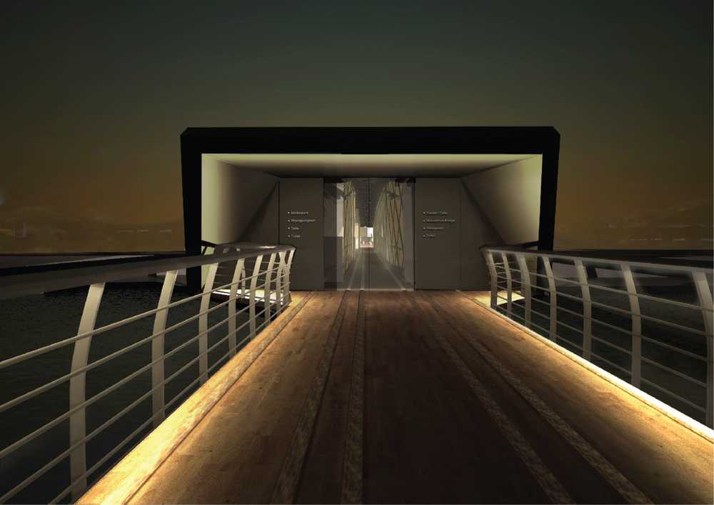
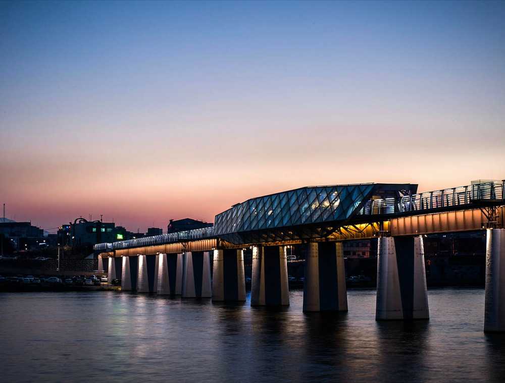
The bridge is an unused train track in the Daegu province in South Korea. Instead of eliminating this architecture, we worked on a project to create a new cultural space by creating a museum and a shelter here.
- Client | Administration of Daegu in Gyeongsangbuk-do
- Cowork | Minkyoung Lee (researcher), Prof. Baek Myungjin (director), Hyejin Yang (senior researcher)
- Duration | 3 months
- Responsibility | logo production, sign system design and production
- Tools | Illustrator, Photoshop, SketchUp
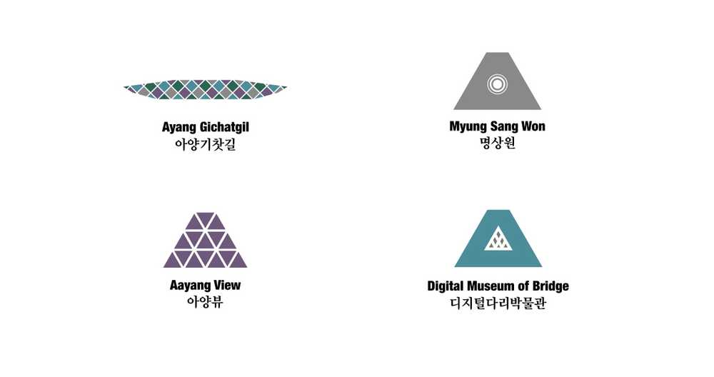
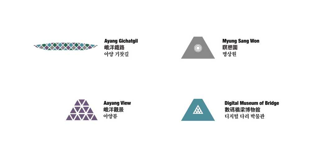
We developed the logo of Ayang brdige based on its external shape of the side and the front. Long shape of the museum is divided into three different areas. We naturally made the cut triangle shape of the building cut into small logos of the spaces, and the shape viewed from the side of the museum became the logo representing the Ayang Bridge.
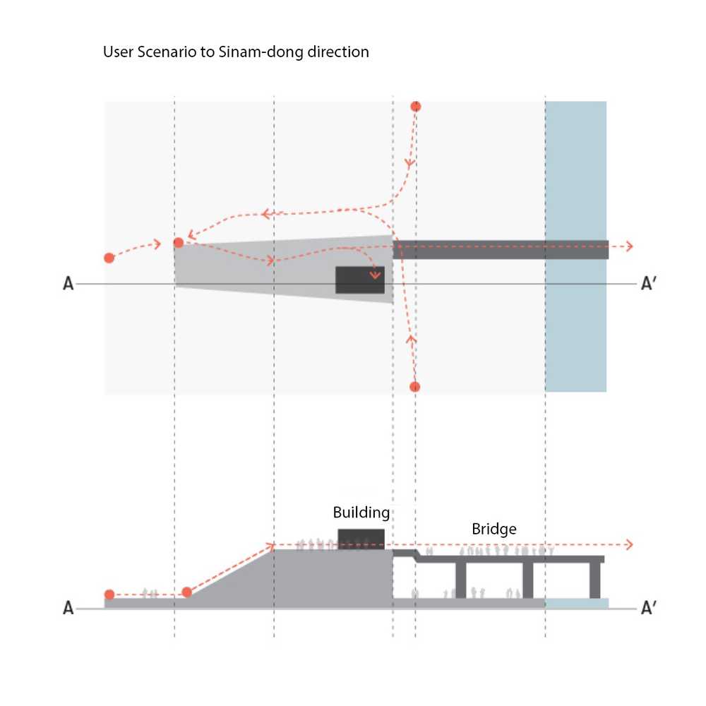
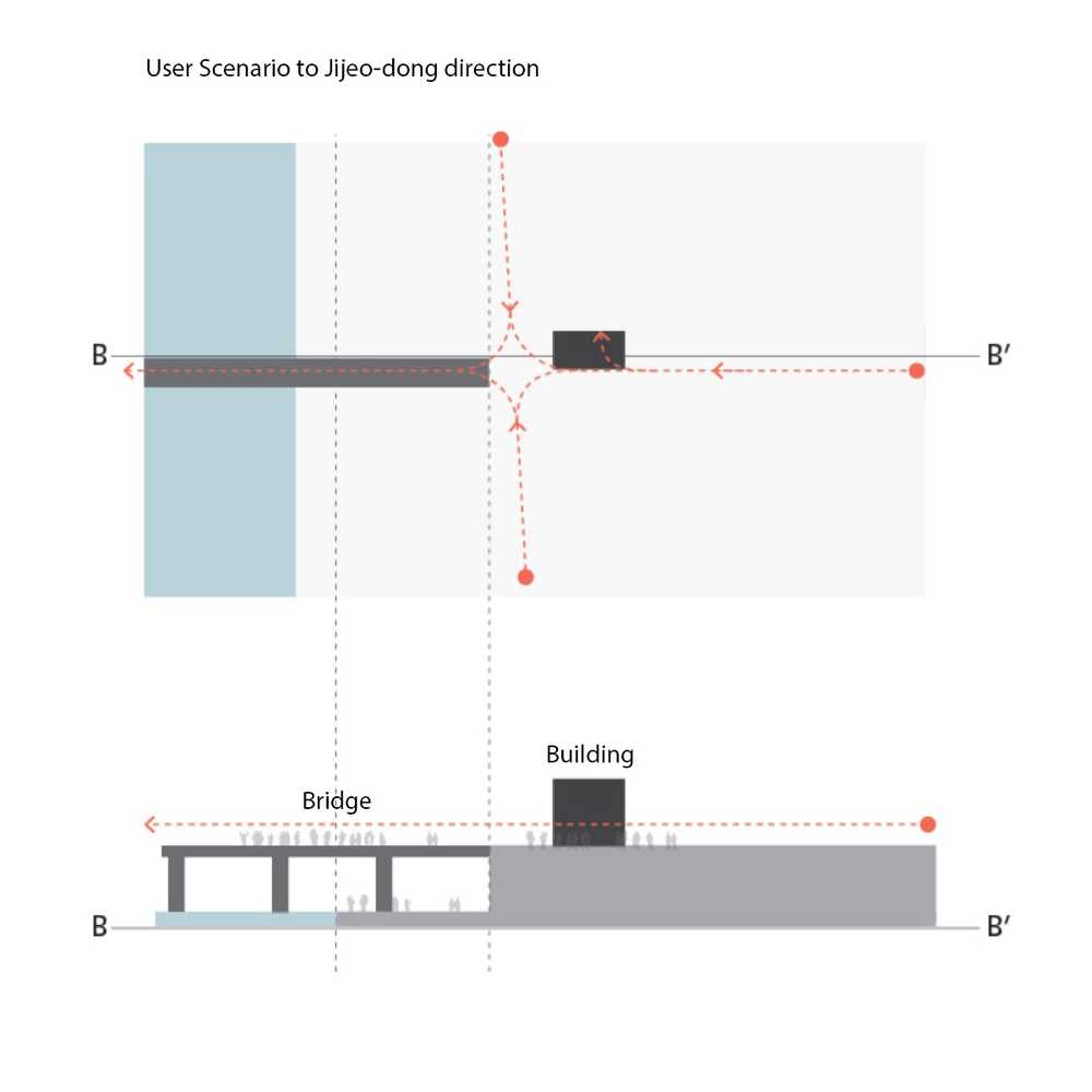
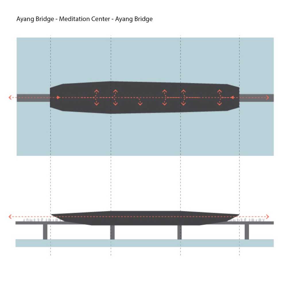
We made a user flow of the museum. The museum is formed in the shape of a long tunnel along the railroad bridge. Since there are no other entrances in the middle, all the space users can enter and leave will be the front entrances and exit of the back. But we had to consider people not only entering or leaving the museum but also walking inside. Therefore, we drew user scenarios considering people outside and inside the structure. We wanted to make clear of outer passageways so that people wouldn't twist the lines in the narrow streets.
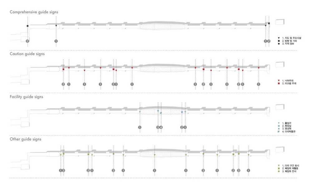
We made four types of signages. And place them regarding the user scenarios. Orderly we indicated the signages in the building's development figure. Orderly (1)Comprehensive guide signs, (2)caution guide signs, (3)facility guide signs, and 4)other guide signs.
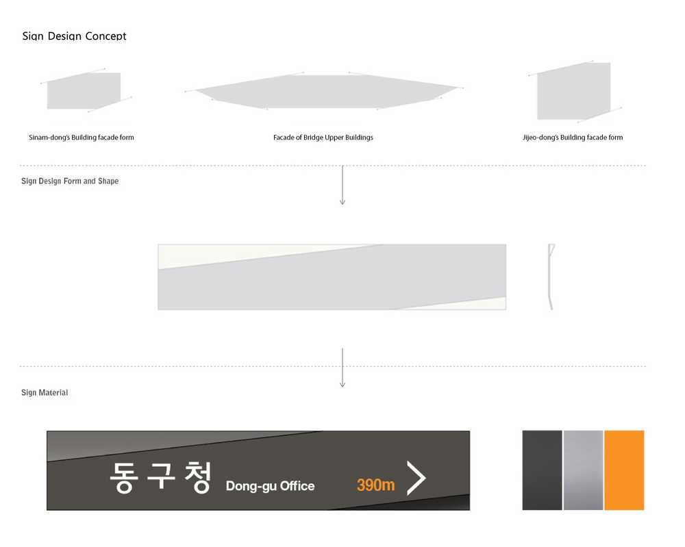
The direction of the diagonal line commonly applied to the two types of the bridge upper building structure and the above-ground part was reflected on the design of signages.
For the material and finishing treatment, rust prevention treatment and fluorine coating were applied to the steel panel.
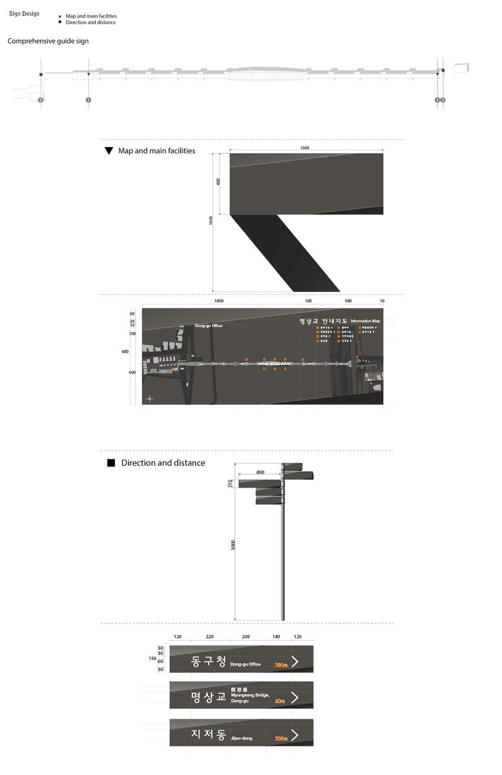
Comprehensive signage and direction signage is placed on all exits. Distances to main places from the signage are marked.
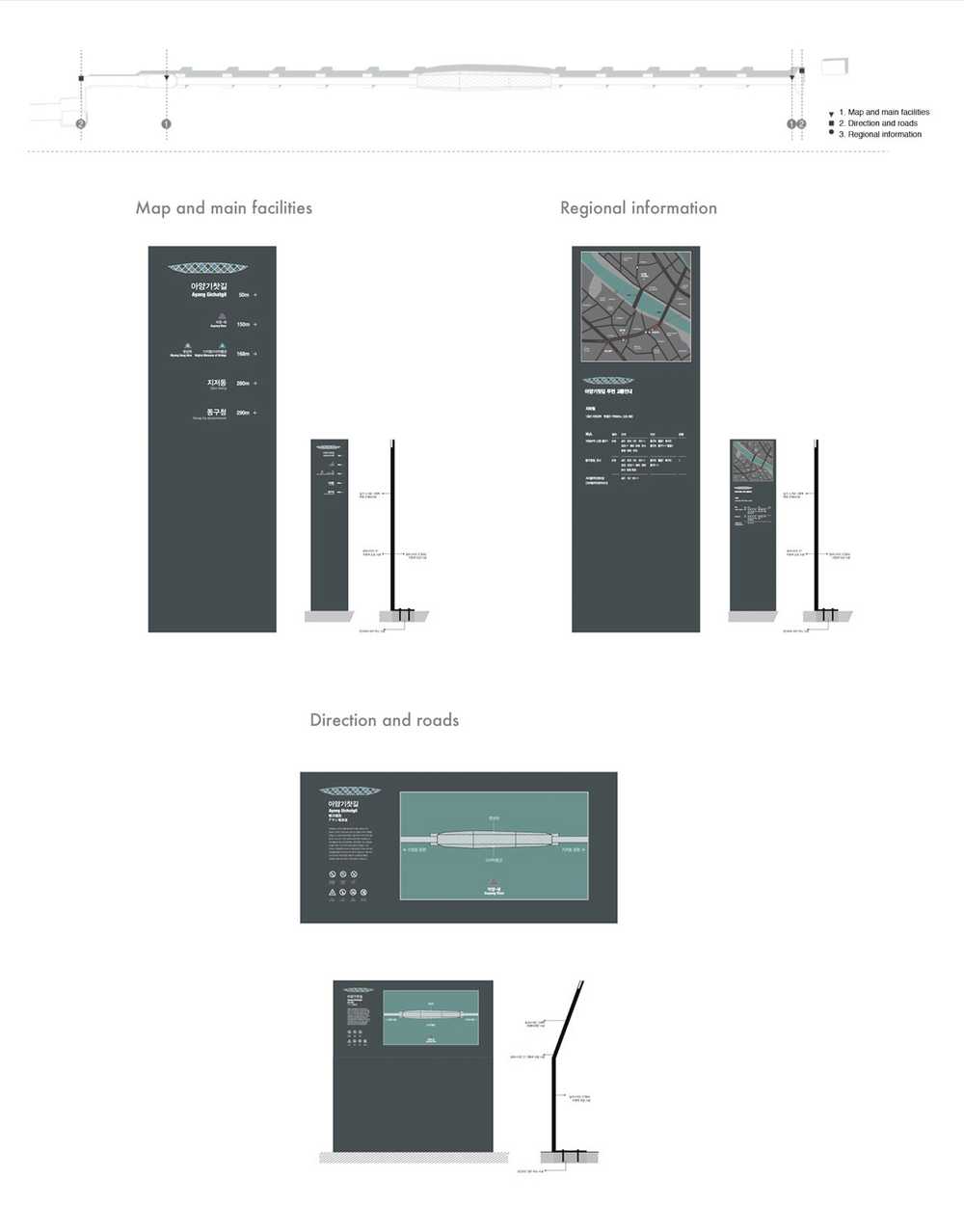
Main design signage is designed differently from the general signages. Considering user experiences and the branding of Ayang bridge, we applied mapes and logo to the signage and tilted it. We intended to make users want to enter the building.
