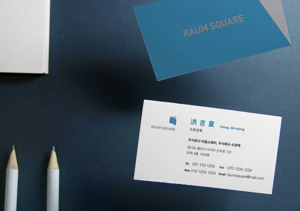
Identity Design for Land Development Company, Raum Square
February 8th, 2017
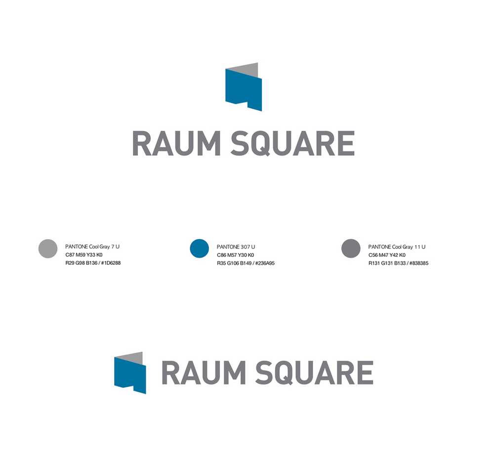
I was responsible for the identity design of Raum Square, a architectural planning, land and housing service company. Graphic motifs are from a house with door, its shadow made by sunlight, and the expandable meaning of open square to deliver the image of Raum Square which means space(room) and its creed that they can build anything.
- Client | Raum Square
- Duration | 2 months
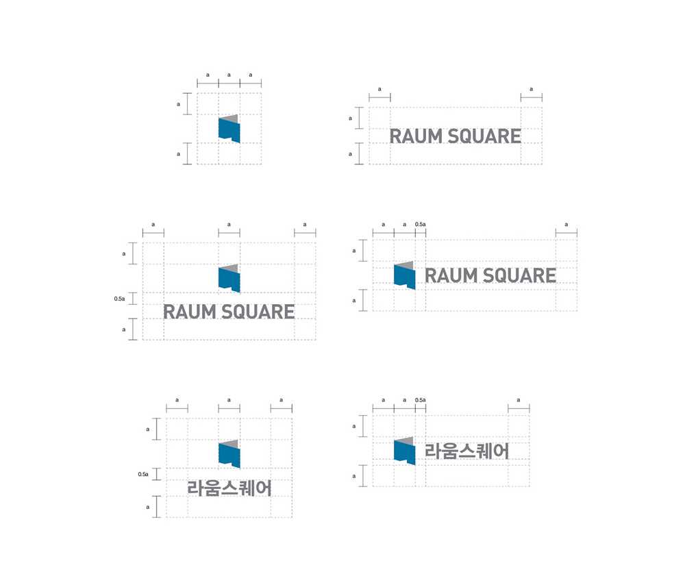
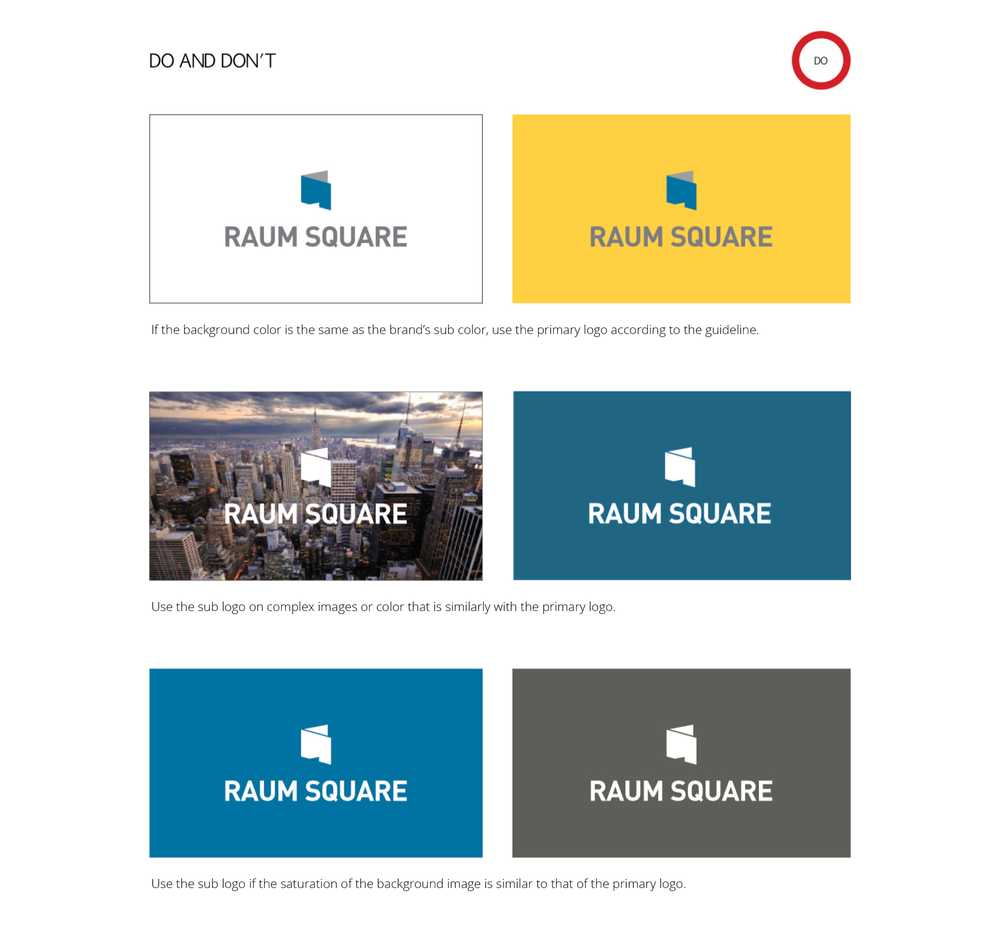
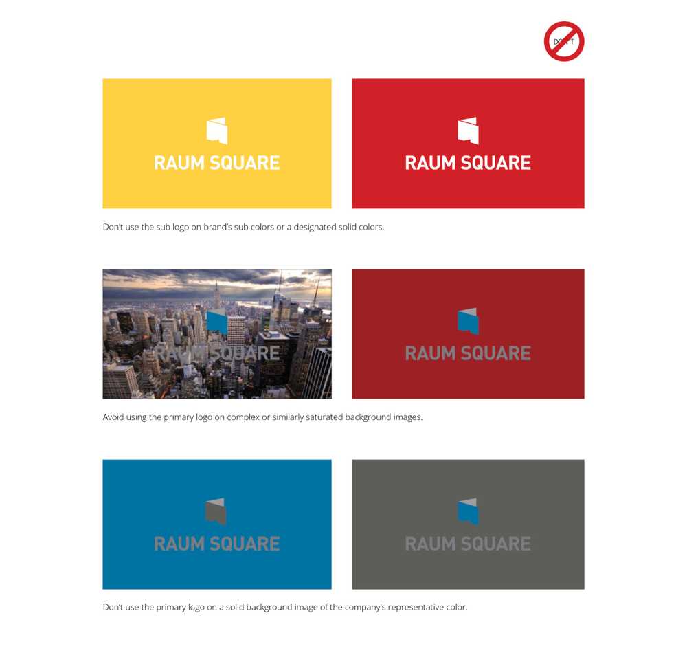
- Responsibility | project management, brand planning, brand image, identity guideline production
- Tools | Indesign, Illustrator, Photoshop
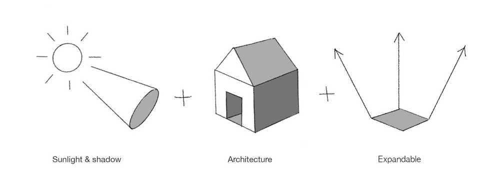
I got the idea of the sunlight and the building square, but I was contemplating how to synthesize the concepts. In the meantime, I was able to proceed with the idea by seeing the sunlight hitting the building wall and creating shadow.
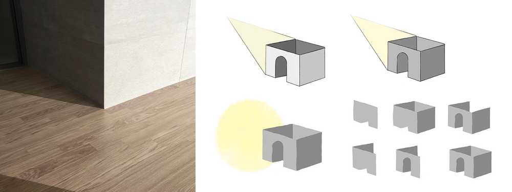
The logo is composed of simple two shapes impressed by the contrast between the vivid light and the dark, and a wall is opened to express the expandability of the company.
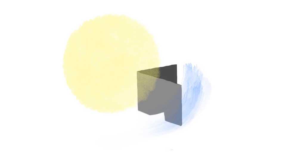
The colors of the logo symbolize three things that are needed for people to live. It is composed of yellow (sub color), which symbolizes sunlight, gray (main color), which symbolizes concrete or soil, and blue (main color), which symbolizes water essential for human life.
