UI System and Identity Design for Human Resource Managing Project, The Plus
March 3rd, 2019
The Plus is a new business field undertaken by HCG. It aims to create online and mobile services related to human resource management. The Plus project launched various human resource management services such as Performance Plus (performance management system) and Time N Plus (working hour management system) from 2017 to 2020. The identity design and UI system for The Plus and launched production services were designed and produced to maintain existing services and develop more services in the future.
- Client | HCG
- Cowork | Minkyoung Lee (designer), Junwon Lee (publisher)
- Duration | 3 months
- Responsibility | project management, making structure of design system, overall design, converting design into CSS
- Tools | Sketch, Illustrator, Photoshop
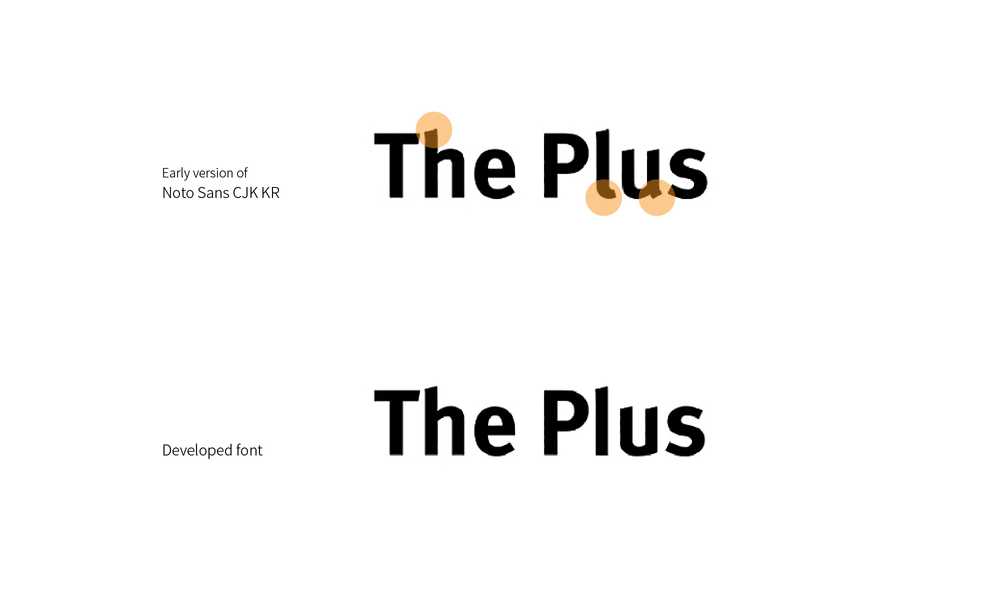
The Plus is a project and team belonging to the Korean company Human Consulting Group. Considering such a company's characteristic that has many Korean companies as clients, Noto Sans CJK KR, an open font, was used as the font for the service. I refined the logo font to differentiate it from the font used in the service and to increase the logo's visibility.

With the client's request to match a logo design and the project's name, The Plus, I started designing with the plus symbol as a motif. They wanted to make users achieve entrepreneurship, progressive spirit and improve work efficiency through this project, The Plus. I expressed those key points through the images of wind-generating power and elevation.
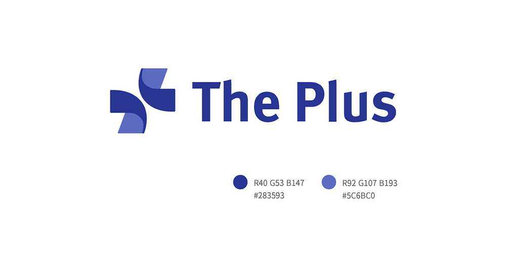
Since The Plus plans to launch a variety of services under the name of The Plus, the logo was developed based on the above structure for visual unity.
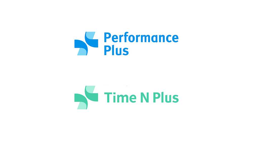
 These are logos of the services created by The Plus project. Each of the services has its theme, color and name.
The motif of logo symbol was obtained from the cross shape that symbolizes plus. Its dynamic form reflects the ideal of an enterprising emotion of The Plus project. The font was developed based on Roboto by removing obtrusive parts of the typography.
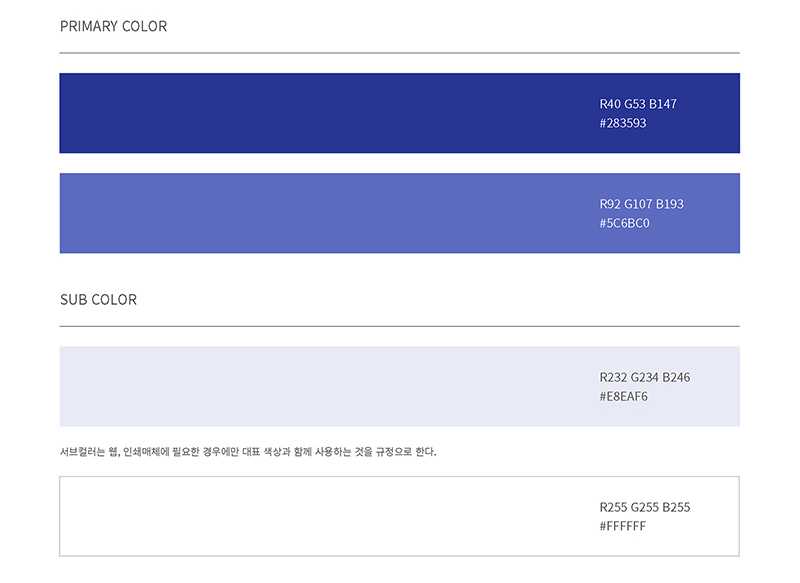
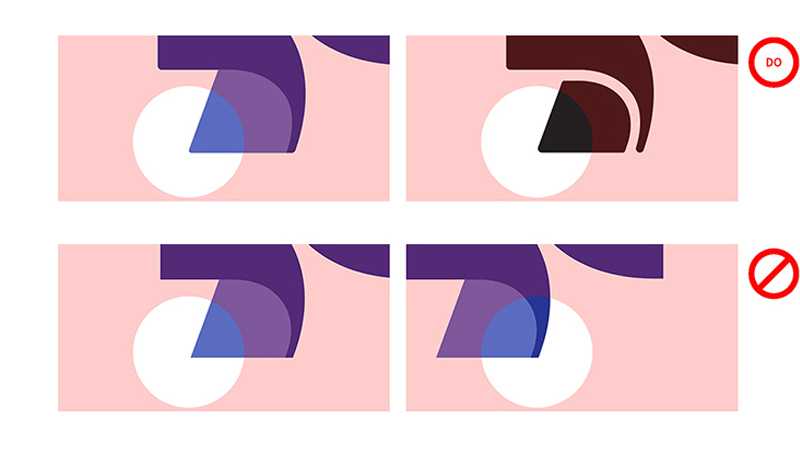
I rounded the edges of the logo to upgraded its finish and perfection. The logo should be careful with the shape of symbols and using with letters since it has to be applied to a variety of media and services' identity.
UI system and icons of The Plus is based on Material Design
In order to apply integrated design to various devices and services, we conducted an integrated design project to organize the UI based on Material Design. Only the representative colors of each service (blue theme for Performance Plus and green theme for Time N Plus) are applied differently to ensure uniformity of the project.
Icons and user image style
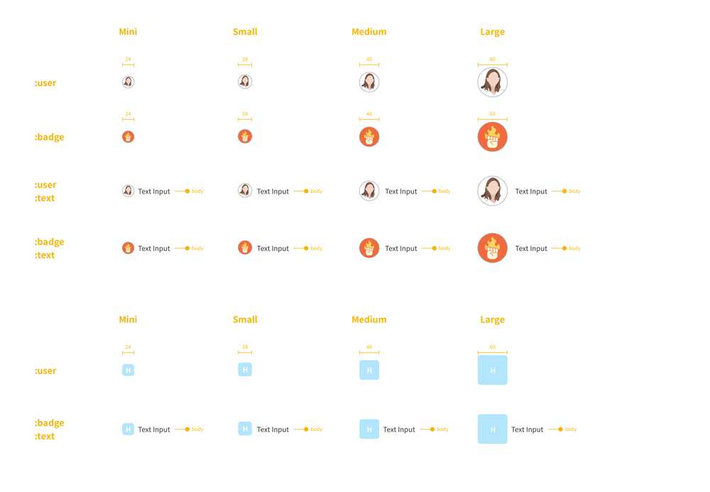
Font style
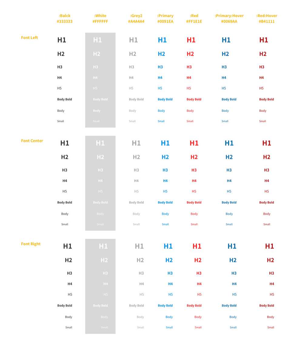
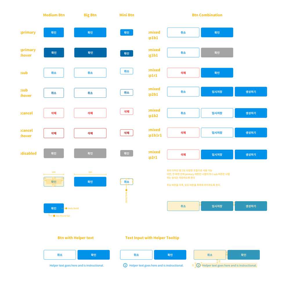
Buttons
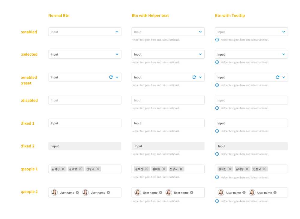
Select buttons style
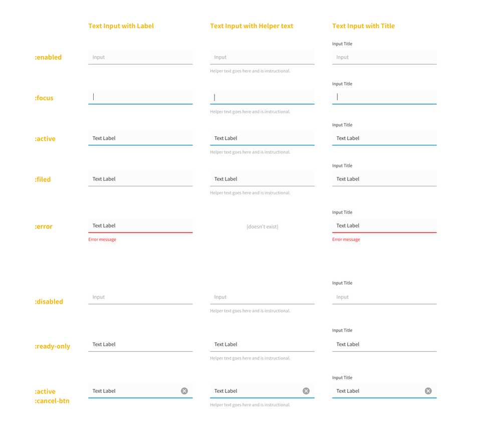
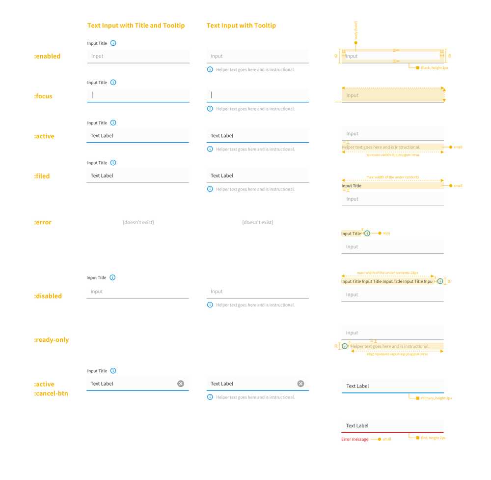
Text inputs
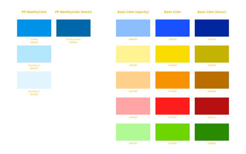
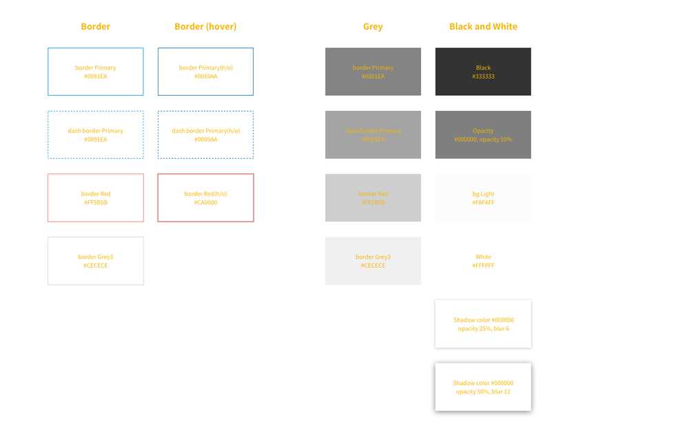
Color style
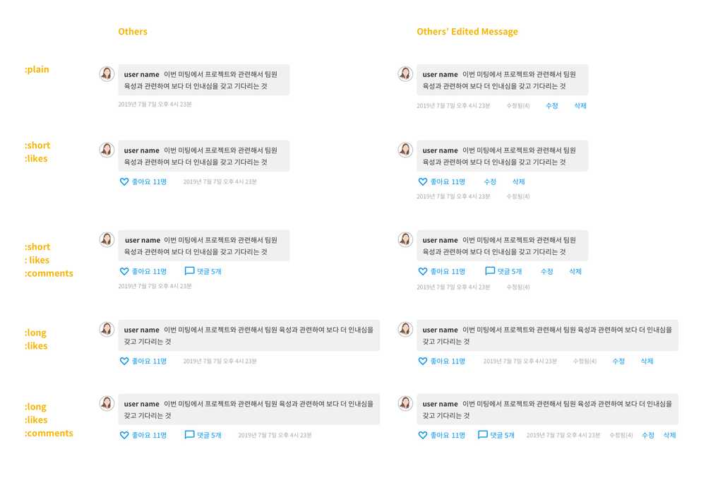
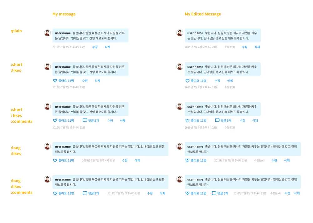
Converstaion style
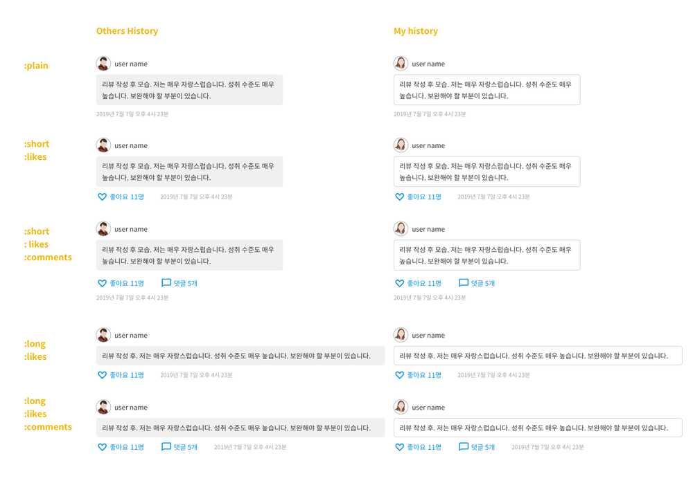
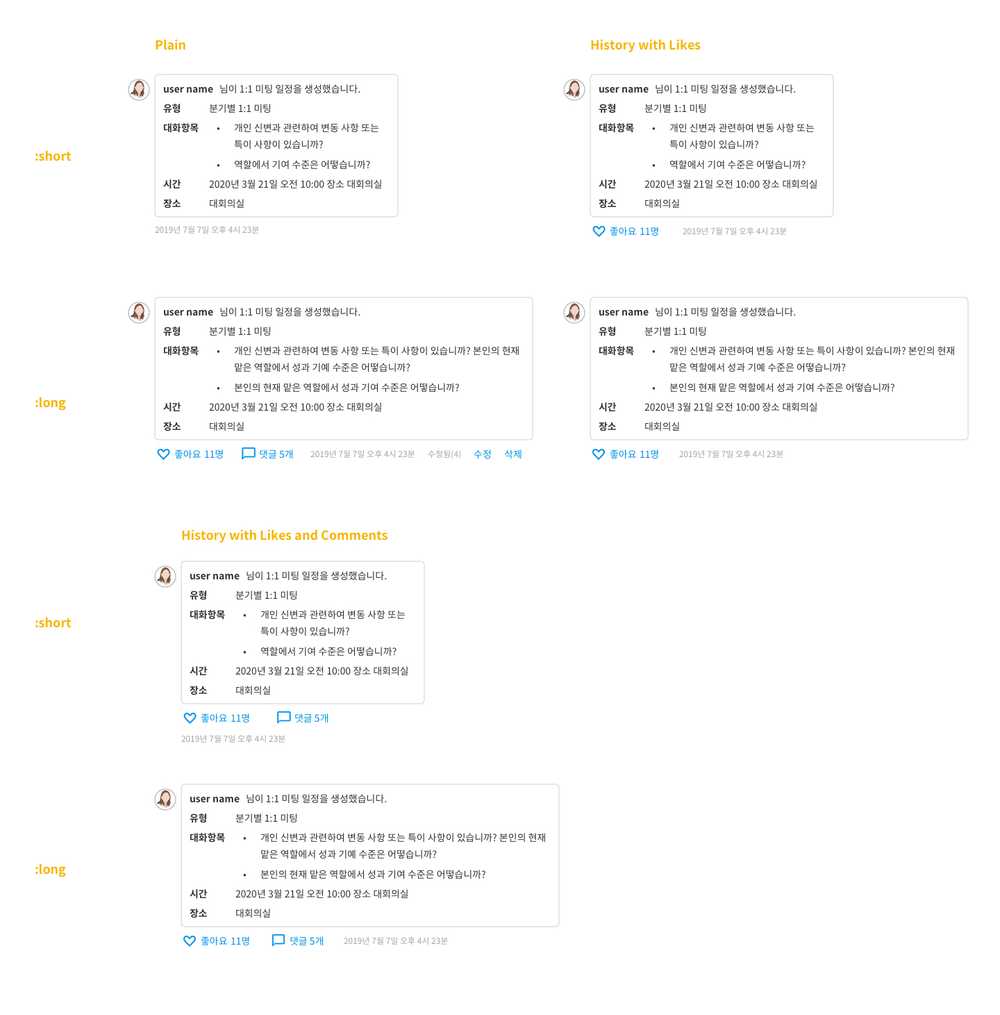
History and log style
